BLACKERBY VIOLIN SHOP
CONTRIBUTORS

Role: Web Designer, UI/UX Designer
Blackerby Violin Shop has provided Austin’s orchestral community with string instrument products and services since 1995. It is a business frequented by string players of all levels.
Problem: Blackerby was lacking in online presence, struggled to drive traffic to their website, and wanted to better utilize their website to streamline both in store processes and increase online sales.
Task: Improve Blackerby’s website visuals and user experience to make a positive impact on online and in store traffic.
WEBSITE REDESIGN
46% INCREASE IN ENGAGEMENT
27% INCREASE IN SITE TRAFFIC


THE PROCESS
INFORMATION GATHERING
I first conducted 4 user interviews with string instrument players to discover what users want from an online string instrument shop, what common frustrations users experience in the online instrument and accessory buying process, the most commonly sought products from string shops, and the strengths and weaknesses of Blackerby relative to their competitors.
I performed affinity mapping to organize interview observations into groups, which allowed me to identify 4 areas that users focused on: online shopping, information, atmosphere, and try before you buy services. With these key groups in mind, I created design action items and assigned priorities to their related tasks.

The last step was to look into Blackerby’s competitors, both local brick-and-mortar shops and online retailers, to evaluate how to best differentiate Blackerby in the online string instrument space.
Throughout the interview process, I found that:
Many users were weary of purchasing instruments online, but were open to buying accessories for convenience
Ordered from most to least important, users value:
High quality products
Products within their budget
Speedy delivery of products
String players often seek out online string shops for informative purposes: browsing inventory for in-person visits and budget evaluation, seeking out instrument care basics, and product recommendations
Player’s cited that their positive opinions of string shops were tied to friendly, knowledgable staff, transparency, and trustworthiness
Before purchasing an instrument online, players want to be able to hear and feel the instrument
While analyzing the current Blackerby website, I determined:
There was excessive text with few visual breaks, making it difficult to extract important information quickly which could result in user fatigue
There was little consistency in website assets such as images, buttons, font sizes, etc
On product pages where the product was over $3000, there was no add to cart button with no explanation (the reason for this was Blackerby didn’t want to ship items over $3000)
Important information about rentals, and performance hall booking were hidden in the terms and conditions rather than being at forefront informational pages
Product pages only included images of products and the price, but lacked further information about the products such as descriptions and composition details which may deter users from purchasing online


DESIGN PROCESS
ATMOSPHERE
Blackerby’s most prominent competitive advantage was its reputation as a small, local business with a welcoming atmosphere and transparent processes. To emphasize Blackerby’s small business status, I employed a cozy color palette of dark greens, browns and reds and homey serif fonts. While Blackerby’s professionalism and reliability were communicated on-site through the shop atmosphere and employee-customer interaction, I felt the current website didn’t accurately reflect the expertise possessed by the Blackerby staff. To more clearly communicate Blackerby’s professionalism, I standardized the website components for a cleaner UI, developing uniform styles for buttons, images, website text and other commonly utilized website elements. In addition, I reworked the website’s copywriting to highlight Blackerby as a long-time, trusted staple in the Austin orchestral community.
ONLINE SHOPPING
I focused next on better integrating online shopping into Blackerby’s website through its home, shopping and product detail pages. On the homepage, I added sections at the top of the page to highlight categories of purchasable instruments (violins, violas, etc.) with accompanying images to encourage users to browse the in-store and online inventory.
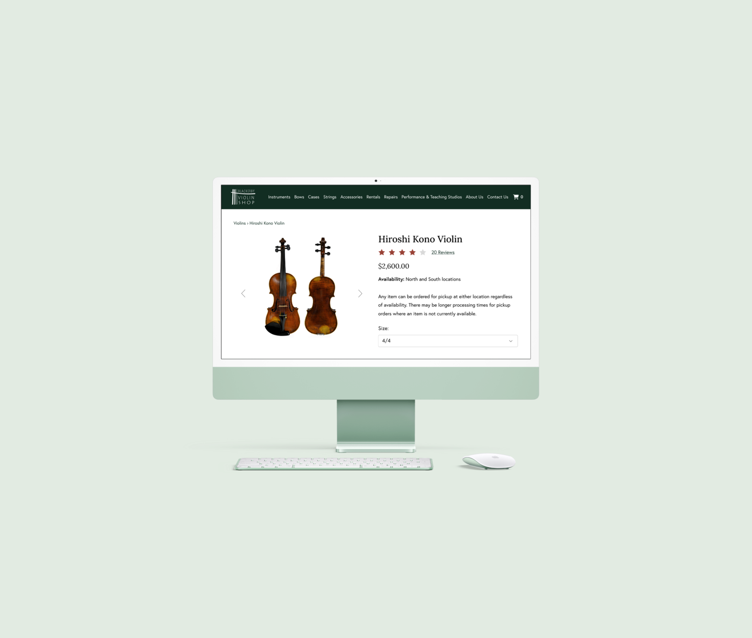
On shop pages I adjusted the background to be all white to match the product cards to create a more clean and online-shop-like appearance. I ensured all product cards would be square in size, with product images fit inside to prevent any image overflow. The product titles and prices were originally side by side and center aligned, which wrapped awkwardly and made it difficult to extract information about the product quickly. Keeping in mind the importance of budget friendly items for users, I changed the text so the price was on top and bolded, with the name of the product below it and left aligned for readability. Finally, I added a filter for price so users could narrow their instrument search based on their budget.


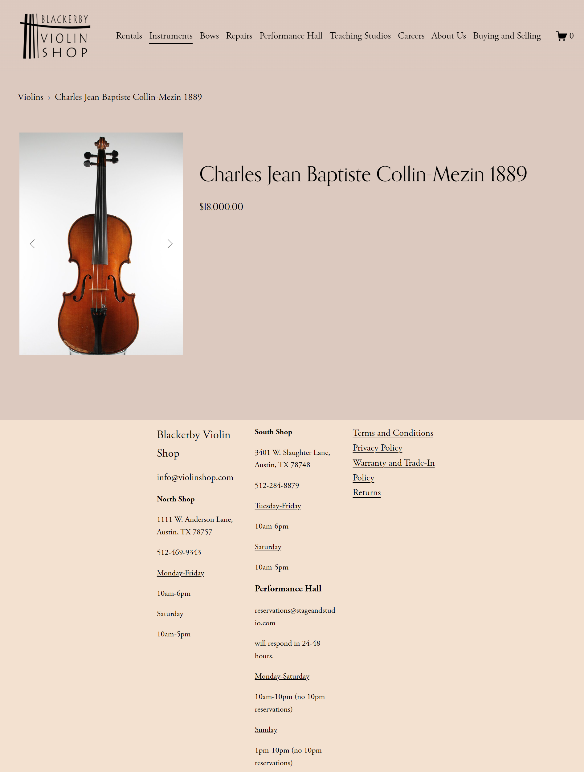
I then reworked the product detail pages to be more valuable to users, including information such as: instrument information, product variations such as size and color, store location availability, reviews, and videos of the instrument being played. To prevent user confusion at the lock of “add to cart” button on products with prices over $3000, I implemented a short line of text that would autofill on appropriate items to inform users that items priced above $3000 were only available for purchase in store.
TRY BEFORE YOU BUY
Rentals were one of Blackerby’s most popular services, but the webpage suffered from long text with few breaks, and was lacking in important information up front. To combat the large amount of information I made the page easier to digest by breaking up the text with relevant and informative visuals and images.
To account for the length of the page, I implemented a secondary navigation to allow users to jump to different parts of the rentals page based on their needs. In comparative sections, such as monthly vs yearly rentals, I placed content side by side so users could more easily see their differences. I also included crucial information prominently that was previously only found in the terms and conditions such as Blackerby’s rental credit program, rental levels, and damage fees prominently in the design.

PERFORMANCE HALL AND RESERVATIONS
Blackerby’s performance hall had two dedicated pages: one where users could submit requests to book it, and one to explain its purpose, limitations and pricing. Previously, the booking page had no indication of what time slots were available, and users would need to switch to the event calendar page to determine when to book. To facilitate the booking process, I included a calendar beside the booking form so users could both see the performance hall availability and fill out the details of their request on the same page. On the informational page, I broke up the text of the performance hall and teaching studio info into several sections with accompanying imagery for ease of user understanding.


THE RESULT
I delivered 8 Figma page designs, a color palette, and component guidelines to Blackerby. After gaining the approval of internal stakeholders, I implemented the designs on the Blackerby SquareSpace website using the base site builder, CSS, and HTML. As a result of these changes, the traffic of the site increased by 27% and the engagement increased by 46% within the first year.
CONTRIBUTIONS
4 user interviews
Research report
8 Figma page designs
CSS and HTML code
Product copywriting
8 implemented page designs via SquareSpace